
It’s been a while since I’ve enjoyed an e-commerce experience. The trend in the industry has been to add more and more noise that distracts from the true purpose of an online shopping experience (i.e. conversion). These ideas are harmless in theory, but it is often their execution that leaves something to be desired. The biggest culprit of this noise is a module I have grown to hate: the pop-up.
First, let me define what I mean by a pop-up. This is a web or mobile element that pops up or overlays on top of the main content of a site or app. It’s the discount offer, the chat box, and so on. The beauty of the pop-up is that it operates outside of the typical flow of a web experience. The problem with the pop-up is that it operates outside of the typical constraints of a web experience.
Let me explain.
Pop-ups are the quick fix to skirt around constraints, lack of space, and design challenges as you can just push the information into this temporary digital billboard. But at what cost? This type of experience disrupts the traditional web browsing experience and the reality is, the default behavior of users when they encounter pop-ups is to figure out how to make them go away as quickly as possible.
A recent study found the modal (pop-ups that take up your entire screen) to be the most hated advertising type for both mobile and desktop users.

Advertising types rated by like vs dislike
Clearly, this isn’t something users love. I’ve also accepted such overlays are a necessary evil, but we all need to be more mindful when it comes to execution, as they can overwhelm and deteriorate experiences online.
Does this look familiar?

We’ve reached a point of oversaturation when it comes to this design element and it’s already a crappy experience to begin with. In the world of pop-ups, I’ve found two categories: passive vs. disruptive. Passive are the ones that are floating in the corner or off to the side. You can engage with them if you want, but you don’t HAVE TO. They can be ignored, even if they are annoying at times.
The far more egregious form of the pop-up is the disruptive one, which literally takes over the entire screen and makes you engage with it (i.e. the modal). You MUST engage with this type of pop-up or figure out how to close it (which is often easier said than done). Let’s take a look at examples of each.
Offer Pop-up/Modal (disruptive)
This is definitely the most common – I can’t remember a site I’ve gone to when I haven’t encountered a pop-up like this offering me a discount of sorts. Discounts work for conversion, but when should this be triggered? Surely not the moment they land on your site? Surely not for every user, especially returning customers? These considerations should be taken into account.

Fly by Jing welcome offer
Cookie/GDPR/Privacy Banner (passive-ish)
Another more recent implementation has been the cookie banner (related to GDPR and privacy laws going into effect). Sometimes these are less intrusive and sometimes they’re just obnoxious as you see below. Often they don’t go away until you engage with them, but you can work around them, hence passive-ish. The problem is rather than remembering your answers to these questions, they more often than not seem to fire on every single visit, making them supremely annoying.

The Guardian privacy/GDPR pop-up
Chat Interface (passive)
Then there’s the chat box that follows you around, ready to assist like the overeager sales associate you’d find in a retail store. There are typically more subdued, but they do add to the visual noise and overall browsing experience (especially when combined with the rest).

Harry’s chat overlay
Ratings (disruptive)
We also have the feedback, rating, and survey pop-ups that seem to happen at the most critical moments. Why are you asking for feedback before I’ve completed the task I’m there for? How can I rate the experience before I’ve actually experienced the app? Again, the execution of these pop-ups is a problem.
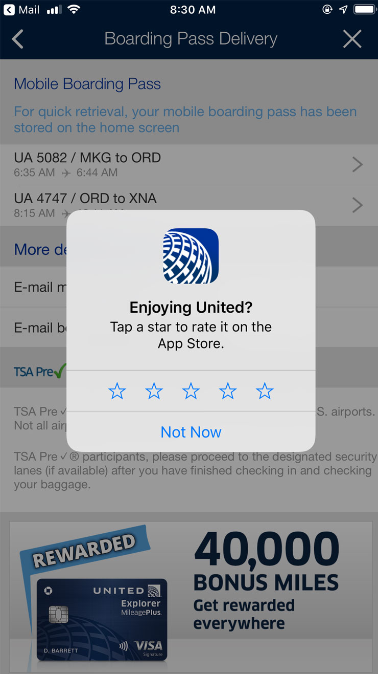
United Airlines rating overlay
Location Access (disruptive)
Then there are browser-based pop-ups that are a bit more intrusive, but that we as designers and developers have less control over. These are often asking for permission to do one thing or another, the most common being to use your location. While I can understand why brands with physical locations would want access to your location, there are certainly more timely and effective ways to capture this information than right when you land on a site. People aren’t looking to give away data before there is a true need.

Best Buy browser location access pop-up
These are just a few, but there are so many more including newsletter signups, donations, password managers, deal finders (i.e. honey), account logins, accessibility plugins, and surveys to name a few.
All of these come from a sensible place, but again, their execution leaves something to be desired.
What not to do
Let’s take a closer look at some examples of how pop-ups can truly disrupt the user experience.
Make sure Pop-ups aren’t stalking users
Let’s take the welcome offer as an example. I see this everywhere – it’s basically the status quo when it comes to pop-ups, especially on e-commerce stores. You land, and a few seconds later you are hit with a pop-up for the basic discount that the brand is willing to offer you. The popular juice brand Jrink leverages this a bit too aggressively. I mean it literally follows you around ad infinitum, like a stalker that is not discreet in the least.


It’s one thing to trigger this pop-up at the wrong time. It’s another to repeatedly serve it over and over again throughout a browsing experience.
Multiple pop-ups at once
Having a pop-up follow you around, but one of my pet peeves is serving multiple pop-ups at the same time, one on top of the other. In this example from Old Navy, we get hit by an offer to open a credit card with the brand. Once you get past that, there’s a discount bar that you’re forced to navigate, not to mention the feedback module floating on the right hand side of the screen.


Is this what you want your user experience to be focused on? Discounts, savings, and credit cards, rather than products or the brand itself.
Value of the pop-up
Certain pop-ups are there, but the question is why? Are they enhancing the experience or not? This Best Buy example caught my eye – when I first land on their site it immediately asked me to log in. I could be convinced that this might improve the customer experience, so I gave it a go as I had an account, and logged in.


What changed? It updated my store from one 5 miles away to one 3 miles away. Otherwise, literally nothing. Was that really worth the disruption to call every user’s attention to? They most likely landed on your site looking for something – should we not focus on helping them find that product first and foremost?
How to execute pop-ups better
Ok so everyone is largely in agreement that pop-ups and overlays are not great. But they are sometimes useful – in those cases, how should we go about utilizing them? What steps should we take to make sure their execution is as seamless and effective as possible? I have three suggestions.
1. Audit your customer journeys
How many other pop-ups or signals is a user getting at any given time? Can you answer this question? If not, it would be a good first step to audit your website or apps current customer journey and note how many overlays are currently active throughout their journey.
Ideally, you only ever have 1 or at most 2 in any situation. If you’re beyond this or firing the same one over and over, it’s a signal to take action – especially if you happen to be triggering multiple overlays at a time.
Pro-tip: when testing make sure to do so incognito and with your cache cleared – this will give you the purest new customer experience that may not be noticed if you visit the site often
2. Consider the context of the pop-up
When should you serve this pop-up in a user journey? This is just as important as the pop-up itself. Timing is everything. Asking for feedback in the middle of an experience makes no sense. Sharing discounts before a customer even knows anything about your products and services feels out of context.
When do customers most care about discounts? When they engage with the price on a PDP or in the cart or at checkout. Consider these situations when you want to use a pop-up to provide that information.
Context is king.
3. Evaluate value add
Try not to leverage pop-ups or overlays unless they are truly enhancing the experience. Getting hit by modules focused on logging in or asking for your location or notification preferences and even reviews are often not adding value. They may be nice to have for the business, but they are typically not adding value to the customer.
In this case, either find the right time (and the right context) to trigger these requests or remove them from the experience altogether because they are not serving the customer in a meaningful way.
Of course, not all engagements with overlays are under our control – browser, device, and plugin behavior is on the user, but for the things that are encountered on our websites and apps, we should be more thoughtful about how and when we use them.
We must also consider that most users spend most of their time on other apps and websites – places that are most likely not following best practices. What does that mean? It means that users are starting to train themselves to ignore a lot of the pop-ups and intrusive elements found in their browsing experiences.
So while a single overlay may seem harmless – it may be better to find alternative solutions that remove friction from these common patterns that users are learning to overlook.
Reduce overlay overload.
related reading