
Thanks to our good friend Excel, grids and spreadsheets are king when it comes to reporting culture. It’s become ingrained in how we do business today, but ever so slowly, we are seeing data visualizations catch hold.
Grid data is great when you want to delve into the details of what may be going on, but visualizations offer you something different and just as important.
They can be a powerful tool that help you better understand the inner workings of your business or product. These are the 3 biggest reasons why we need to leverage data visualizations.
1. Interpret Data Faster
Grids have all the data, but understanding what’s going on from a quick glance isn’t possible. When we first look at data, we want to easily understand the story being told. The typical grid often gives you everything you could ever ask for, but you’ll have to spend some time deconstructing what you’re looking at before you can gather any insights.
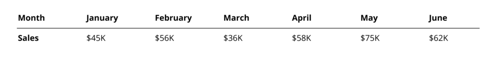
For example, let’s take this simple data set that’s in a grid. Looking at these numbers in this format, it’s hard to see the general trends happening over the months.
If instead we were to visualize this in a simple line chart, things are much clearer, even from a cursory glance.
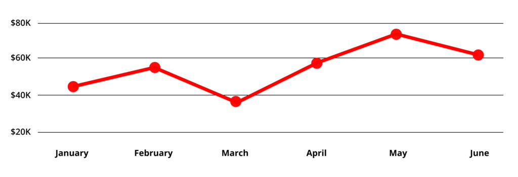
This is a very simple use case of course, but the lesson is applicable to a variety of instances: visualizations allow us to quickly understand and interpret our data. Once you know where to look, you can go back to your happy place of grids, but having this initial indicator helps you make decisions and find insights more effectively.
2. Identify Outliers in the Data
The reason such rapid interpretation is important, is that it enables business users to easily identify outliers in the data and notice trends. Whether good or bad, when unexpected results come about, we want to understand them better. Knowing where to look is a powerful first step.
Visualizations provide this ability in the most efficient way. For example, a simple scatter plot of data points can easily show you where something is amiss.
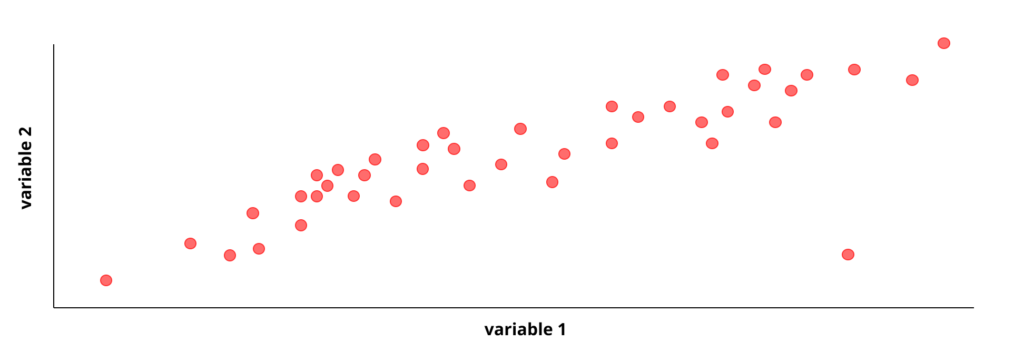
If you can imagine this same data in a grid, you can see how it could easily be overlooked. In this way, visualizations are the perfect medium to quickly identify outliers and aberrations.
3. Make Sense of Larger Data Sets
Having thousands of rows of data isn’t very useful to anyone if you can’t make sense of it. Visualizations provide you a way to look at such data sets in a meaningful way. You can start from a higher-level view of your business or product and slowly drill down into the details as you uncover root causes.
The key is to have a natural path of exploration from the top down. Taking millions of rows and aggregating it into a simple chart is very powerful when in the discovery phase and something that many visualization tools have optimized for.
We’ll be diving deeper into the different types of visualization and when we should use them, but for now the key takeaway is this: data visualization helps make sense of large data sets that are otherwise impossible to understand.
Despite the benefits of data visualization, there are still a number of challenges to overcome, including adoption, proper implementation, and data integrity.
That being said, we should all try to push visualizations when they make sense. It is often the only way to find the truth of what may be happening in your business.
related reading